The third space is central to community vitality
Silver Lake Nature Center unites community members in a positive, shared experience through purposeful exhibit content and design. Most of us are busy beavers when it comes to activities of daily living. We rise and shine at home, trudge off to work, shuttle back, and repeat the cycle.
When we do stop to take a breath, it’s often not at home or work but a public gathering place like a park, restaurant, hair salon, or library. The urban sociologist Ray Oldenburg studied these so-called third spaces (or third places), and, in his books The Great Good Place and Celebrating the Third Place, argued they are central to community vitality: “The character of a third place is determined most of all by its regular clientele and is marked by a playful mood, which contrasts with people’s more serious involvement in other spheres. …They are the heart of a community’s social vitality, the grassroots of democracy, but sadly, they constitute a diminishing aspect of the American social landscape.”
We think about Oldenburg’s work a lot at Content Design Collaborative. How can we design community-driven nature centers and museums that promote feelings of warmth, possession, and belonging? How do we ground visitors in a sense of place?

Silver Lake Nature Center
A useful case study is the Silver Lake Nature Center in Bristol, Pennsylvania. Local residents have treasured Silver Lake’s 235 acres and 4.5 miles of trails since the property was converted from a farm to a nature center in 1987. The County of Bucks Parks and Recreation Department asked us to design a new visitor center for Silver Lake that inspires connections with nature for people of all ages. Our collaborative process—including workshops with community members and back-and-forth with the County—allowed us to develop a beautiful, more vibrant third space. Here are three ways we did it.

1. Bring the outdoors inside.
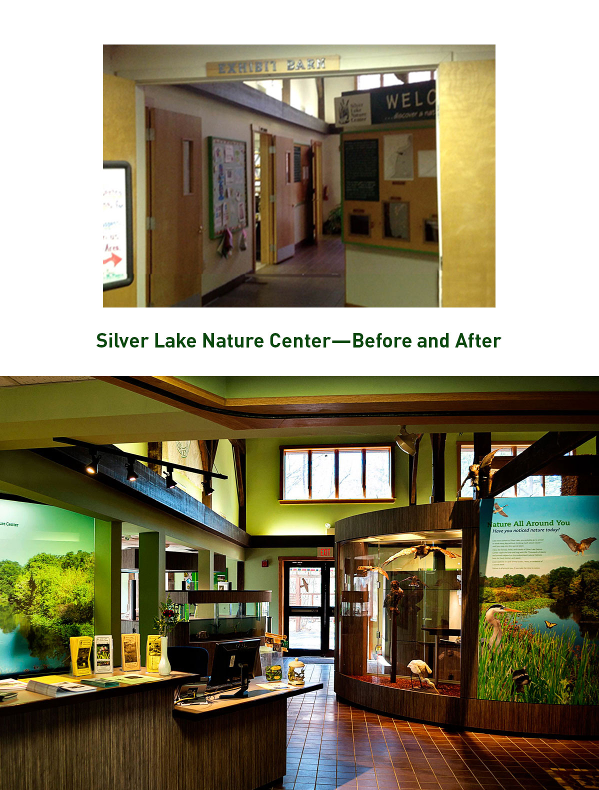
The original visitor center (seen in this walkthrough) was a dark, confined space with tired exhibits and unwelcoming partitions. Without expanding the footprint, we designed an open floor plan with walls of glass, clear sightlines, and free-flowing, accessible pathways through the exhibit areas. This “room with a view” now serves as a bright, beautiful reception area that encourages visitors to interact with staff and get ready to go outside. Visitors gather at a 12’x8’ site map to plan their hikes. This area serves as an attractive new meeting room that motivates residents to preserve the living treasure of Silver Lake for generations to come.

2. Appeal to all ages.
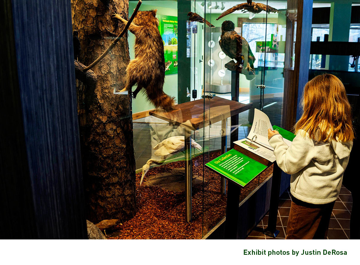
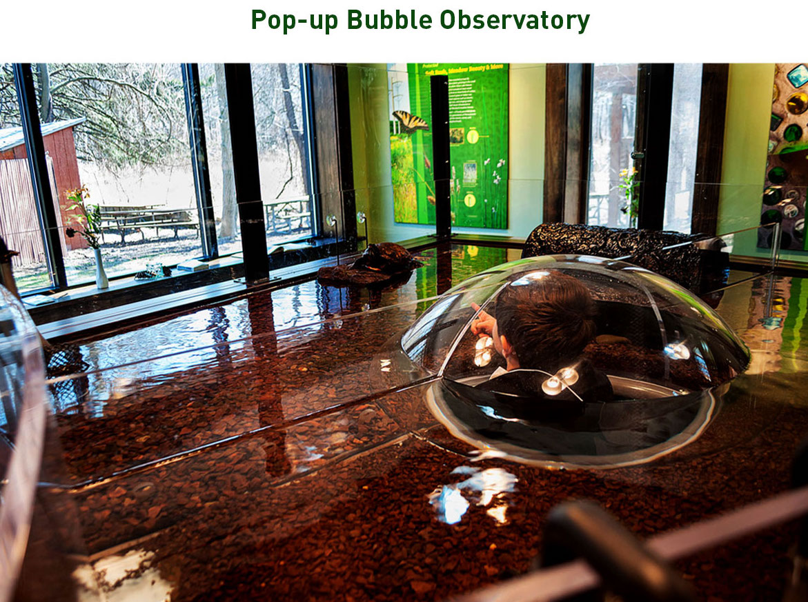
A welcoming third space is family-friendly and offers something for all generations. Silver Lake’s original visitor center featured a replica tree that young people could sit inside. The exhibit was popular but well past its shelf life. When brainstorming replacement ideas, we got down on the floor to see the world through the eyes of preschoolers. Our answer was nifty with bubble-shaped terrariums housing indigenous turtles. Small children can safely observe the animals up close and delight in the “just-for-me” scale. This exhibit shows respects for Silver Lake’s youngest learners and inspires their appreciation for nature.

3. Tap the brainpower of local residents.
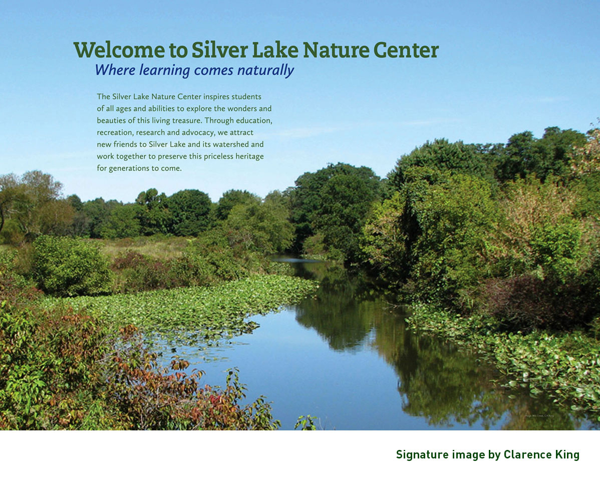
One secret to developing unique content is to collaborate with the community who have a personal interest in the project’s success. They often can help us unearth photographs and stories you can’t find anywhere else. For this project, we turned to professional photographer and historian Clarence King, whose family once owned the Silver Lake farm. Only someone with a firsthand knowledge of the land and history could capture a gorgeous shot like the one above!
Today, visitors to Silver Lake Nature Center kick off their outdoor adventure with a positive, informative experience that bolsters community pride and togetherness. We hope they will want to come again and again. Contact us about your next project. We have lots of good ideas.
Exhibit photographs by Justin DeRosa


