Modest as it may be, the donor panel symbolizes something critical; it represents the generosity of the person to whom the building or exhibit owes its existence. Once a neglected design genre, donor panel systems are now striking features in the public spaces of building lobbies. They have grown in sophistication along with the architecture around it. Digital systems respond to visitors interactions, beautiful sandblasted glass panels enhance the texture of a feature wall. Two examples shown below depict extremes of recognition, the Dell Children’s Medical Center in Texas by Fd2s Design Consultants is interactive; visitors create butterflies when they touch the glowing plaques. The New York University Medical Center by Poulin Morris is an elegant marriage of type and texture. Each is a form of permanent recognition; these will remain in place for the life of the building. Also, each depicts a single level of giving. Located elsewhere are other giving levels.
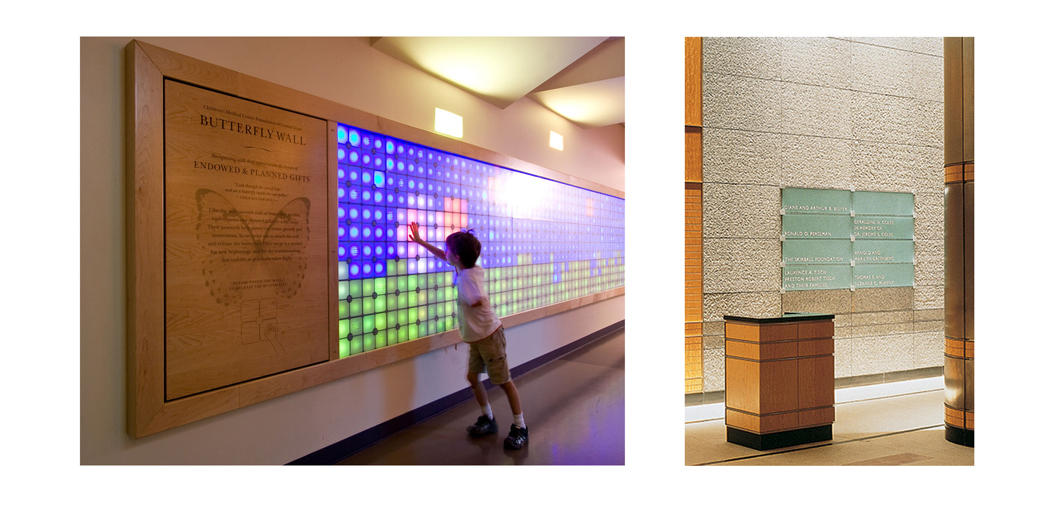
Left: Dell Children’s Medical Center donor recognition program by F2Ds Right: New York University Medical Center by Poulin Morris
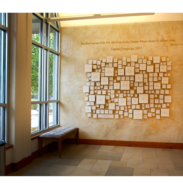
Capital Campaigns are a different challenge, they are for a particular project and need to represent all levels of giving in one location. Relative scale is essential, with larger donors having the biggest plaque and tallest cap height. It’s a challenge to differentiate a $25 gift and a $ 25,000 all on the same wall. A proportional typographic treatment could lead to extreme proportions. If the top donor has a 1.5” letter height how small is the smallest donor, 1/16th of an inch? The designer goes beyond scale and uses material and color to help solve the design problem. Smaller donors can also be clustered onto a single panel within the system, creating a more appropriate relationship to the larger forms of recognition.
The following installations show scale and architectural integration. At the Clark Center designed by Tadao Ando and Gensler, a connecting corridor portrays three levels of giving. It dynamically carries you through space with etched and filled lettering on acrylic is backed by a metallic film creating a subtle drop shadow. Shown in the corridor of the PETA headquarters designed by Lawrence + Beaven Design is a full range of scale with at least five levels of giving represented by typographic scale and weight. Finally, an unidentified Capitol Campaign shown on Pinterest, it appears to be at a Temple, is playful and wonderfully integrated with the textural color of the wall.
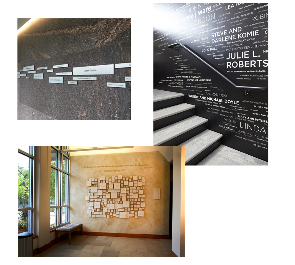
Top left: Clart Art Center by Tadao Ando and Gensler Top right: PETA Headquarters by Lawrence + Beaven Design Bottom: Captial Campaign recognition program, designer and location unknown
This design we found most inspirational for our giving recognition challenge, the donor system for the Parker’s Revenge Archeological Project at the Minuteman National Park Site in Lincoln, Massachusetts. This landmark project has revealed much about how this well-known skirmish, for instance, the pattern of musket balls found in the metallic survey reveals much about the number and location of the combatants. Our fundraising recognition for the project and exhibit will share the same wood-paneled wall as the exhibit. It must represent a large range of giving within the four linear feet dedicated to the system.
Our project is in design development, and the park manager is excited by our design with a variety of wood stain color with routed and printed lettering.
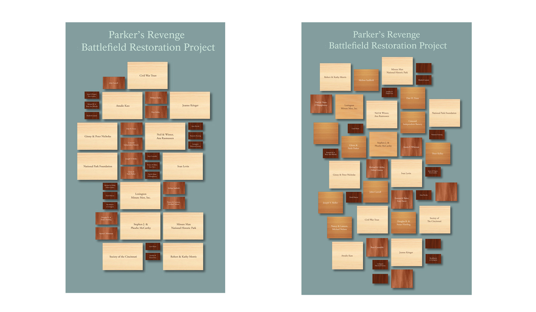

Above are two studies we developed showing a looser and tighter design grid. By mounting the plaques to a backer board, we limit the impact on the paneled wall. Inspired by the stained wood finish made for another project, the Norman Bird Sanctuary signage fabricated by Wood and Wood Signs in Waitsfield, Vermont. By using the right kind of wood with a pronounced grain, in this instance ash, creating a visual link between the wood panel wall and donor system.