Wallpaper therapy isn’t easy
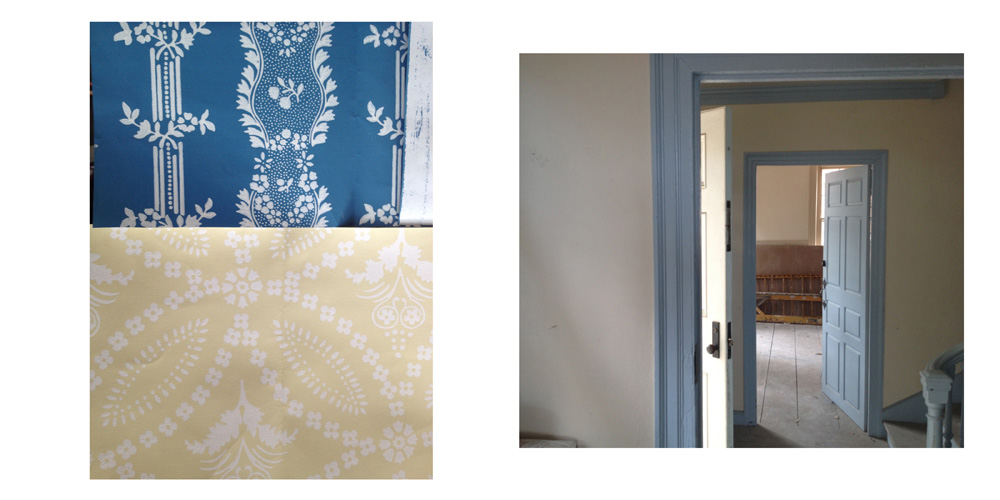
It was a typical onsite job meeting, representatives from the builders, owners, and designers crowded around folding tables discussing agenda items at the Dillaway Thomas House while construction went on around them. Next on the agenda was a milestone in the design-build process, to review finishes and historical wallpaper submittals by the builder, Campbell Construction Group of Peabody. While the sheet rocker on a platform behind us cut out recessed ceiling spots with his spiral saw, Steve Athanas from Campbell Construction unfolded the reproduction wallpaper samples, varieties of Circle Ornament and Boston Floral Stripe from Adelphi Wallcoverings and Coleman Bower from J. R. Burrows and Co.
Our finishes and furnishings consultant Janice Hobson pointed us in the right direction for the project, but it was John Burrows who helped us focus on wallpapers and carpets indigenous to Boston. Many historic buildings have benefited from his expertise, including the President Taft National Historic Site, the Vermont State Capitol, the General Grant House and well over 120 historic locations in more than 30 states. Now all our efforts were put to the test as we unfolded the submittals and placed them up on the wall adjacent to the existing molding colors.
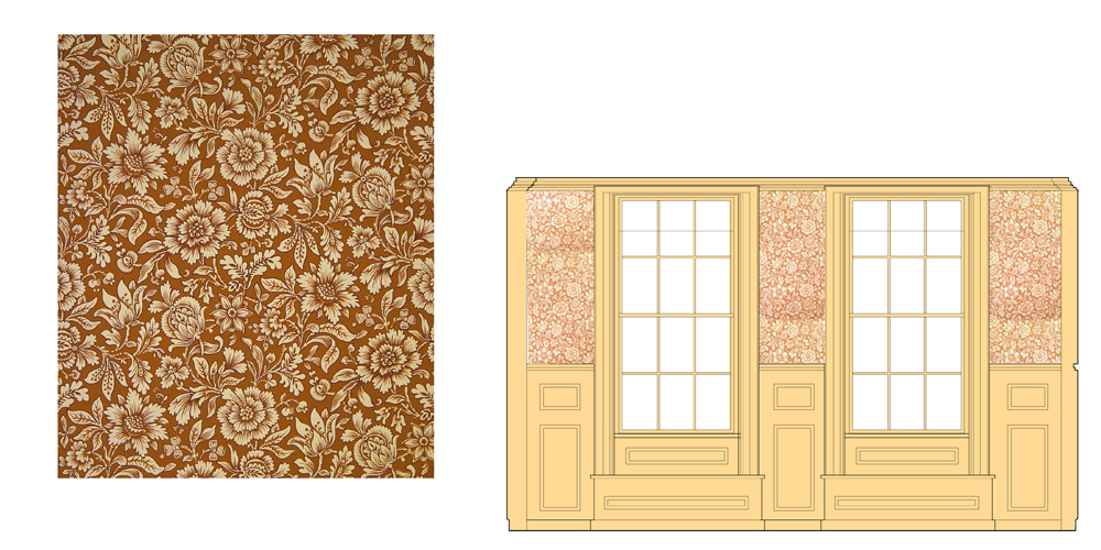
Our first decision was easy; everyone from Content Design Collaborative and the Department of Conservation and Recreation loved the arts and crafts inspired Coleman Bower located in the northwest parlor that would include stories from 20th century Roxbury. Richly textured, it demonstrates the enduring quality of arts and crafts style. We debated the merits of the Rose color, shown above, compared to Butterscotch, but the Butterscotch colorway was similar to the existing woodwork color, so it was selected in the interests of unity.

The next pattern decision would prove to be more difficult; here early 19th century sensibilities ran counter to contemporary ideas of balance and proportion. Our initial design called for a blue foliate named Circle Ornament placed in the east parlor with its baby blue moulding color. It is known in the exhibit as the Dillaway Room because the interpretive focus is on the period of occupation for the last two-thirds of the 19th century by the Dillaway family. This style looked smart on the design elevation, but the actual sample did not elicit much enthusiasm. The pattern was stark and the color temperature off. We reviewed all the colorways, each of us took a turn displaying the sample, first designer Ed Malouf, then Jessica Rowcroft of the Department of Conservation and Recreation, and finally construction supervisor Steven Athanas held up the winning pattern. A more subdued version of Circle Ornament was selected.
Historic stairwells and back corridors were often completed in an ashlar pattern for ease of repair. These busy passages were often damaged and soiled and by gluing a rectangle over the damaged area, this wallpaper is easily repaired. But this style struck us all as very jarring; instead, we selected the Boston Floral Stripe a modest pattern suited for a secondary space in print scale and style. We selected the blue colorway that looked great adjacent to the blue moulding. It only took the designer switching off with the assistant project manager to reach this consensus (where was the masking tape?).
Back to the irksome Circle Ornament. With our new wallpaper selection, the baby blue moulding appeared too harsh. Back to the sample books to find a new blue or will another color altogether. Will the result be a contemporary tone on tone that Mrs. Dillaway would have found dull or the electric color combinations that pleased our Victorian ancestors in their dimly lit sitting rooms?